5 Key UI Design Principles For Beginners
An intuitive guide to 5 fundamental design principles to take your UI designs to the next level.
User Interface Design allows us to communicate and interact with a digital product, whether it be clicking on a button to submit a form, or scrolling through a gallery of photos.
A great UI Design is one that the users don't even notice, yet it creates a seamless user experience for them. A bad User Interface can create frustration and lead the users to abandon the product.
Now that you know why having a user-friendly Interface Design is important. Here's how you can create one.
Every designer keeps in mind a set of principles and guidelines while creating a high-functioning User Interface. Knowing these design principles are key to improving your designs and ensuring a successful career in the design field.
Here are 5 key design principles you NEED to keep in mind the next time you sit down to design -
1. Clarity
Interfaces are meant to make things easier for the users. If the user doesn't understand how to navigate through an interface, it loses all its purpose.
Keep the design clean and avoid using buttons and other distracting elements if they don't serve a purpose to their user. Provide clear CTAs and feedbacks so the user knows exactly what is happening.
2. Consistency
If there's one thing that can make your design look unprofessional at a glance, it's a lack of consistency.
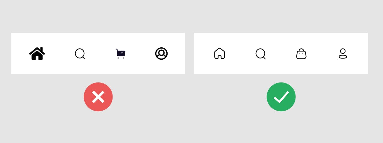
Use of similar design elements makes your design look whole and tied together. Use the same type of icons for navigation and stick to a color scheme to keep your design consistent.
Pro-tip: Use an Icon Pack for a collection of cool and consistent icons to use in your designs. Here's one I suggest - evericons.com
3. Color Theory
There's a lot more to colors than I can explain in this whole article, so maybe I'll write another article talking just about this in detail. But for now, let's just stick to the basics.
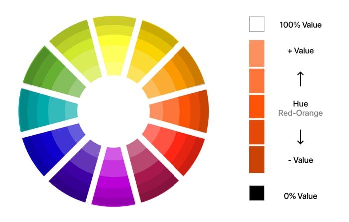
There are three terms that you need to understand about colors: Hue, Saturation and Value.
Hue
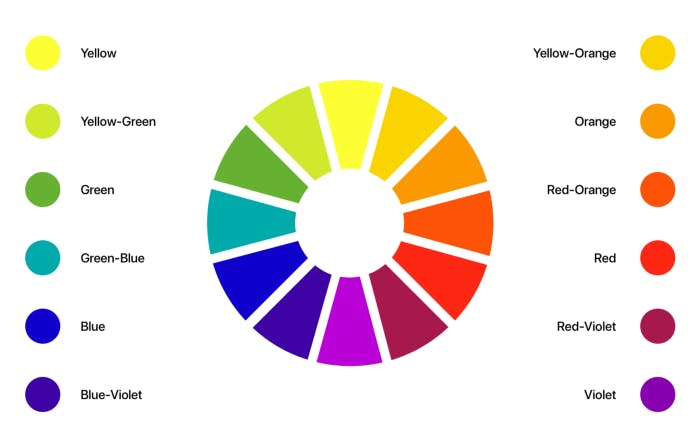
The Hue is just color in its natural state, without any variation in its lightness or darkness. For example, Red, Blue, Green, etc.
Refer to this image for a better understanding👇
Saturation
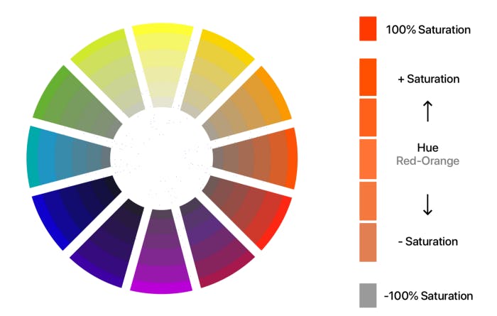
Saturation refers to the intensity of a color. A lower saturation level means a dull greyish color, while a higher saturation level means a more bright and vivid color.
Value
Now let's discuss Value. The Value of a color refers to the amount of lightness or darkness in each color. A value of 0% gives us White color, while a value of 100% gives us Black.
Creating Color Schemes
Okay, now that you understand these terms, you need to know how to use colors in harmony to create a great looking color scheme for your designs.
The image below explains different ways to combine colors with harmony

The 60-30-10 Rule
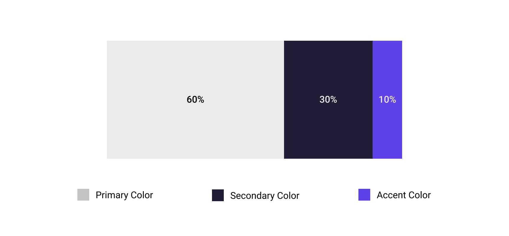
When creating color schemes as a beginner, a good rule of thumb is to pick three colors.
Select one of them as the Dominant/Primary color and use it for 60% of your design.
Pick the Secondary color and use it for 30% of the design.
The remaining third color is your Accent color which is to be used for CTAs and elements that require immediate attention.
4. Typography
Almost 90% of any website, web application or mobile application is Typography. So it's right to say that it's one of the most important elements of a user interface.
Here are a few tips to use typography like a pro -
A. Font Pairing
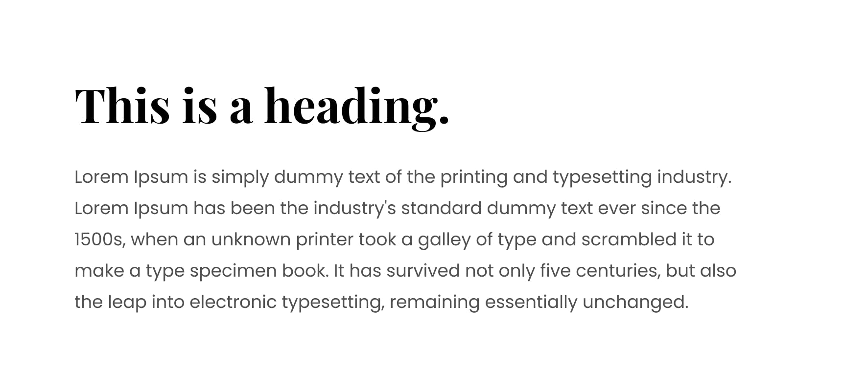
Using many typefaces makes the design look cluttered and unprofessional. When starting out, use just a single font throughout your design. But if you're confident enough, keep the number of fonts to a maximum of two.
Pair different types of fonts with each other to create contrast. For example, use a serif font for the heading and a sans-serif font for the paragraph text. Make sure to choose fonts that are easier to read.
B. Line-Height
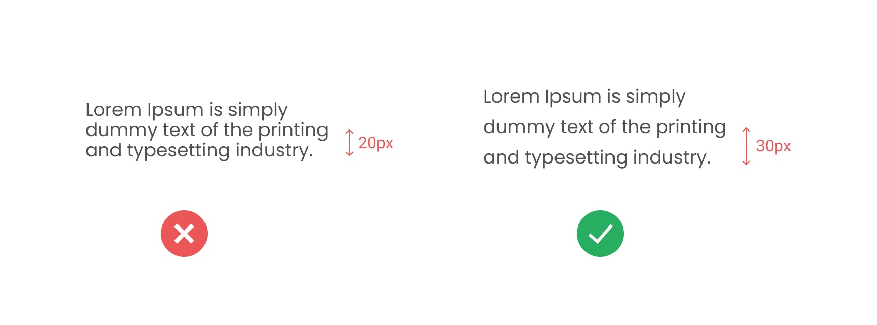
When working with typography, keep in mind to give it a little bit of room to breathe, with appropriate use of white space.
Use more line-height for smaller text, and less line-height for larger text.
C. Font Weight
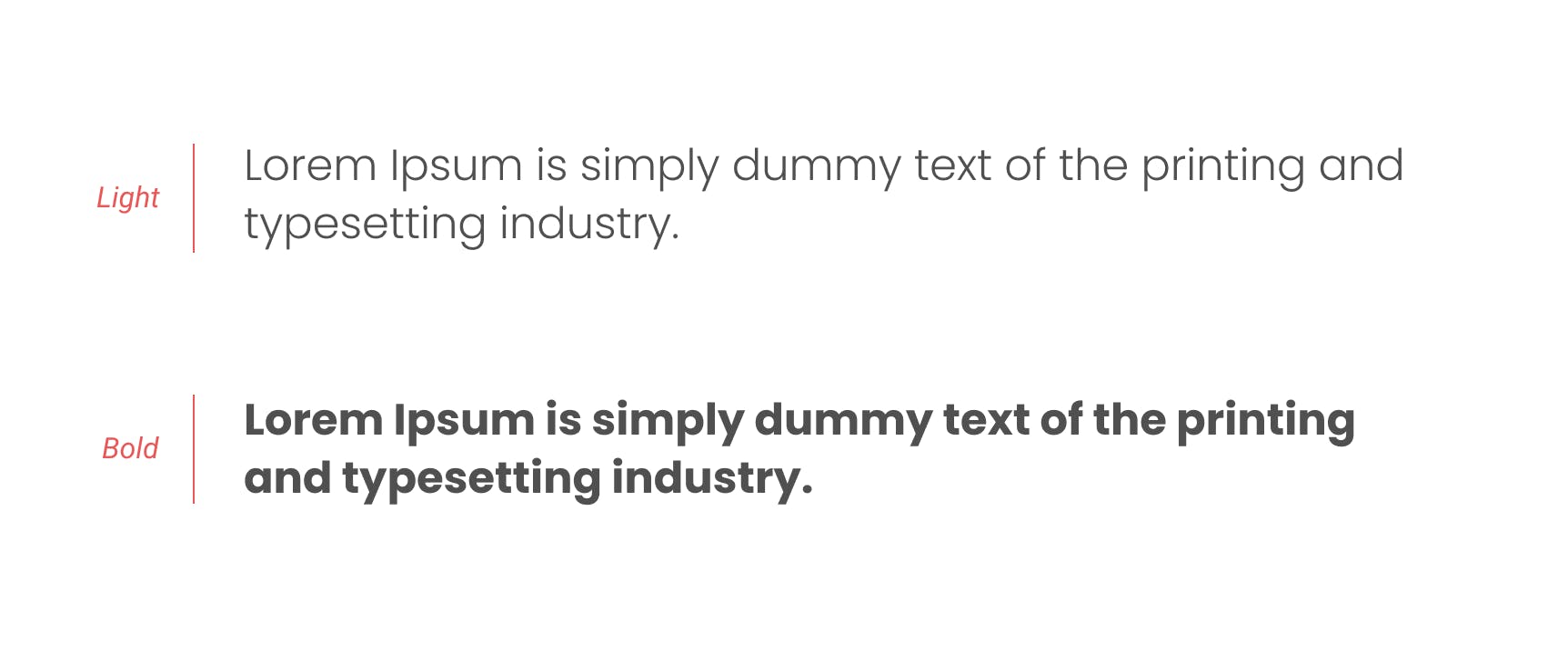
Use different font weights to distinguish between different text elements. Remember that contrast is key to great UI Design.
A pro tip is to skip a weight. For example, use Regular and Bold, Medium and Extra Bold, etc.
But keep in mind that the same color might look lighter on thinner weights and darker on thicker weights.
5. Hierarchy
Hierarchy is important to let the users know where to look and what is important.
There are many ways you can create a hierarchy. Here are a few -
A. Color
You can use color to create hierarchy in one of two ways -
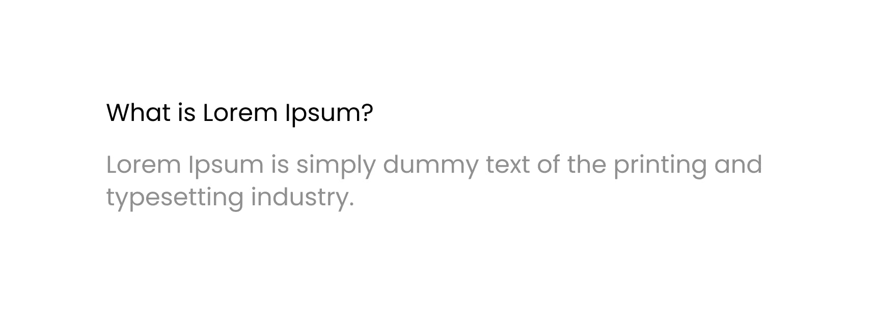
i. Use darker colors for more important elements and lighter colors for less important elements.
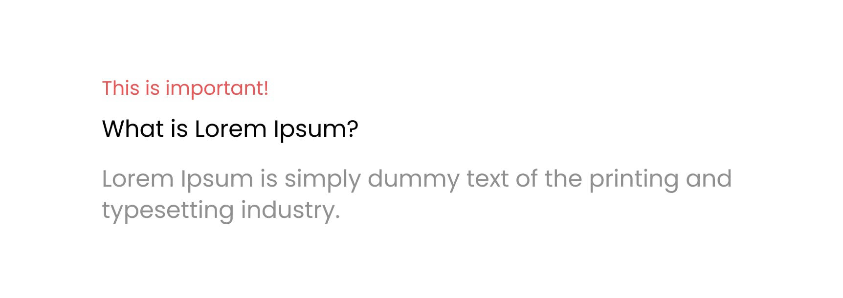
ii. Use an accent color to make something pop. It demands the most attention from the user(even if it is smaller in size).
B. Typography
This might seem obvious to many, but a lot of beginners don't give it much thought.
The bigger and thicker the font size, the more important it seems.

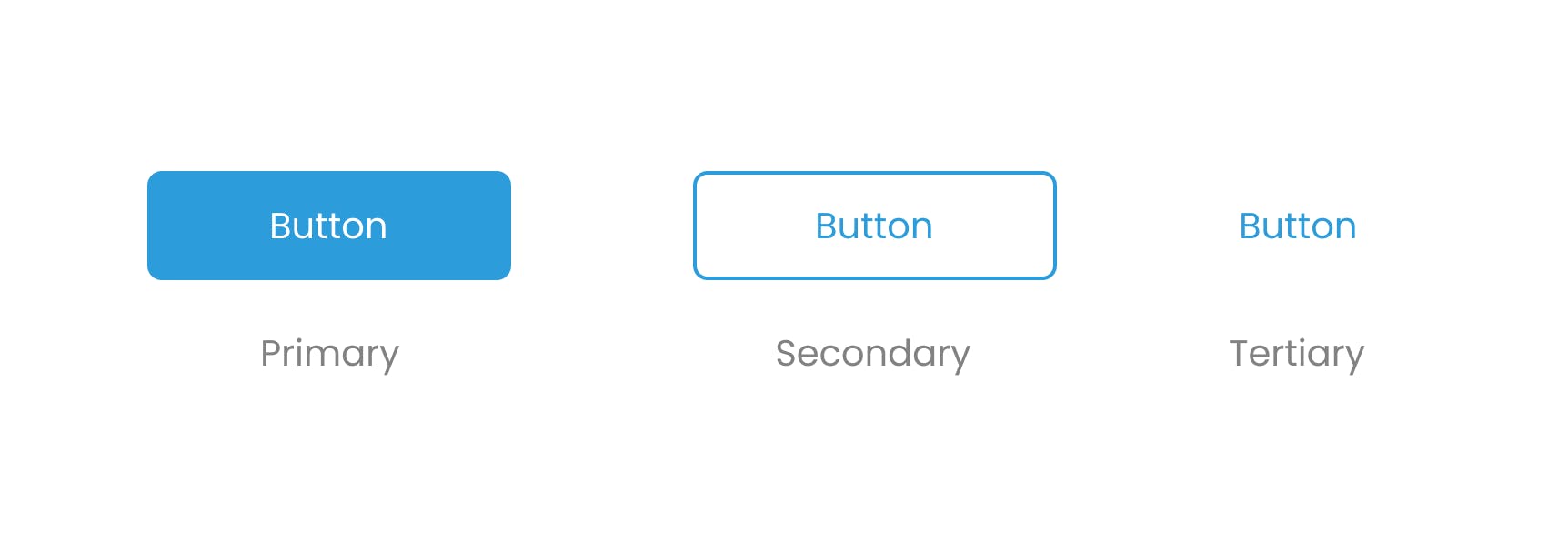
Hierarchy in Buttons
These are a few design principles and tips(among many others) that I've learned over two years of designing. If you would like to add something to make this article more informative, do share it in the comments.
Here are a few other resources you should checkout to get a deeper understanding of the topics I talked about -
- UI Design Principles | 17Seven
- The 4 Golden Rules of UI Design | Nick Babich
- Top UI Design Principles To Keep In Mind | Olga Schors
- 10 Typography Rules | Chris Do
FOR MORE TIPS AND UPDATES, FOLLOW ME ON TWITTER
Hope you found this article helpful. See you in the next one!
